Themes
The GVA HMI features a fully configurable theme engine that controls all visual aspects of the display — function key colours, fill styles, corner radii, typography, status bar indicators, widget styling, and PPI symbology. Themes allow the HMI to be tailored to customer branding, accessibility requirements, or operational environments.
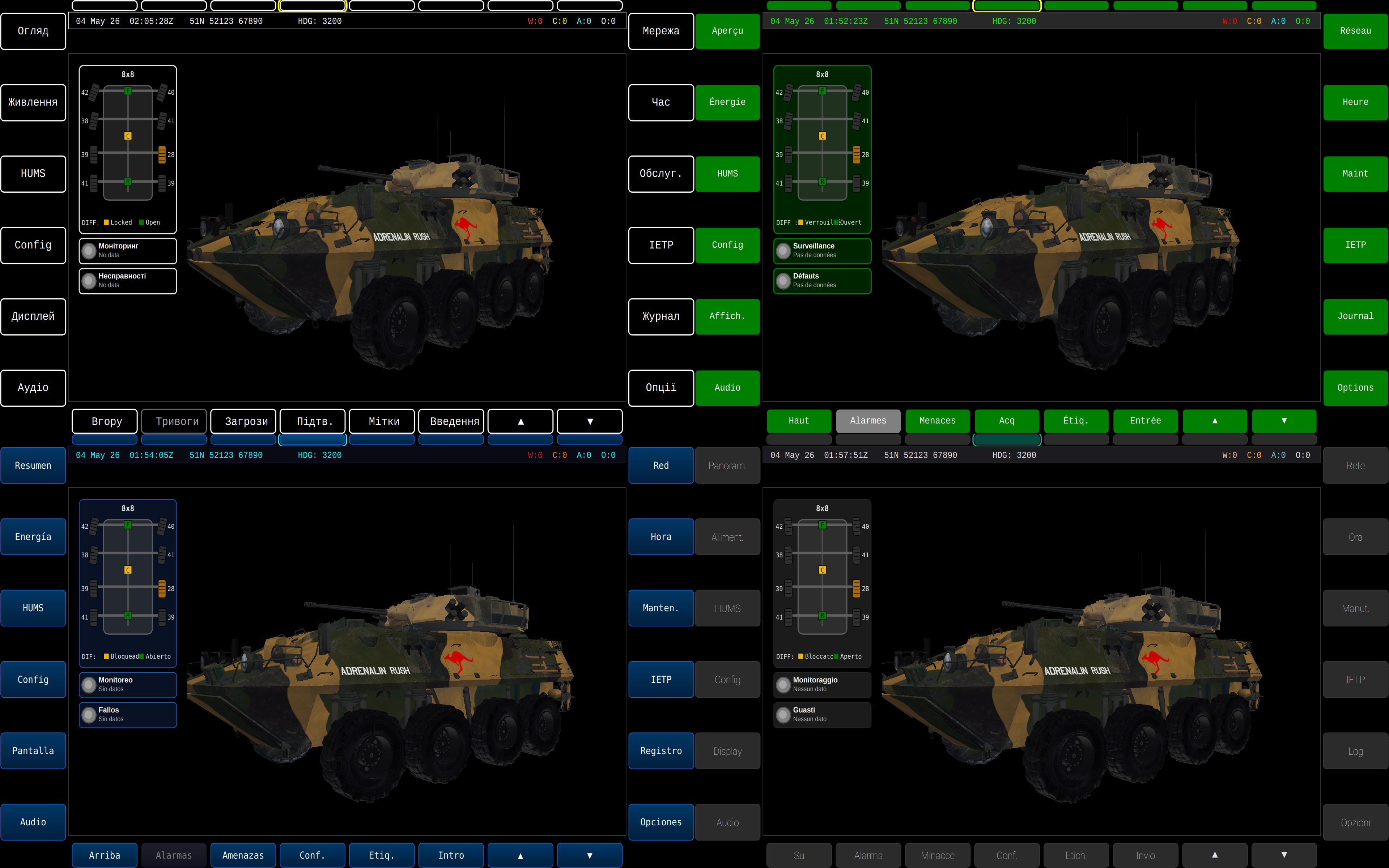
Built-in Themes
Five built-in themes are available out of the box:
| Theme | ID | Description |
|---|---|---|
| DEF STAN 23-009 | defstan |
Standard GVA green/grey/yellow flat colours (default) |
| Astute Blue | blue |
Astute Systems navy/cyan branded theme with gradient fills |
| Android | android |
Material Design inspired dark theme with rounded corners |
| High Contrast | high-contrast |
WCAG AAA accessible high contrast dark theme |
| High Contrast Light | high-contrast-light |
High contrast with light background |
Theme Examples
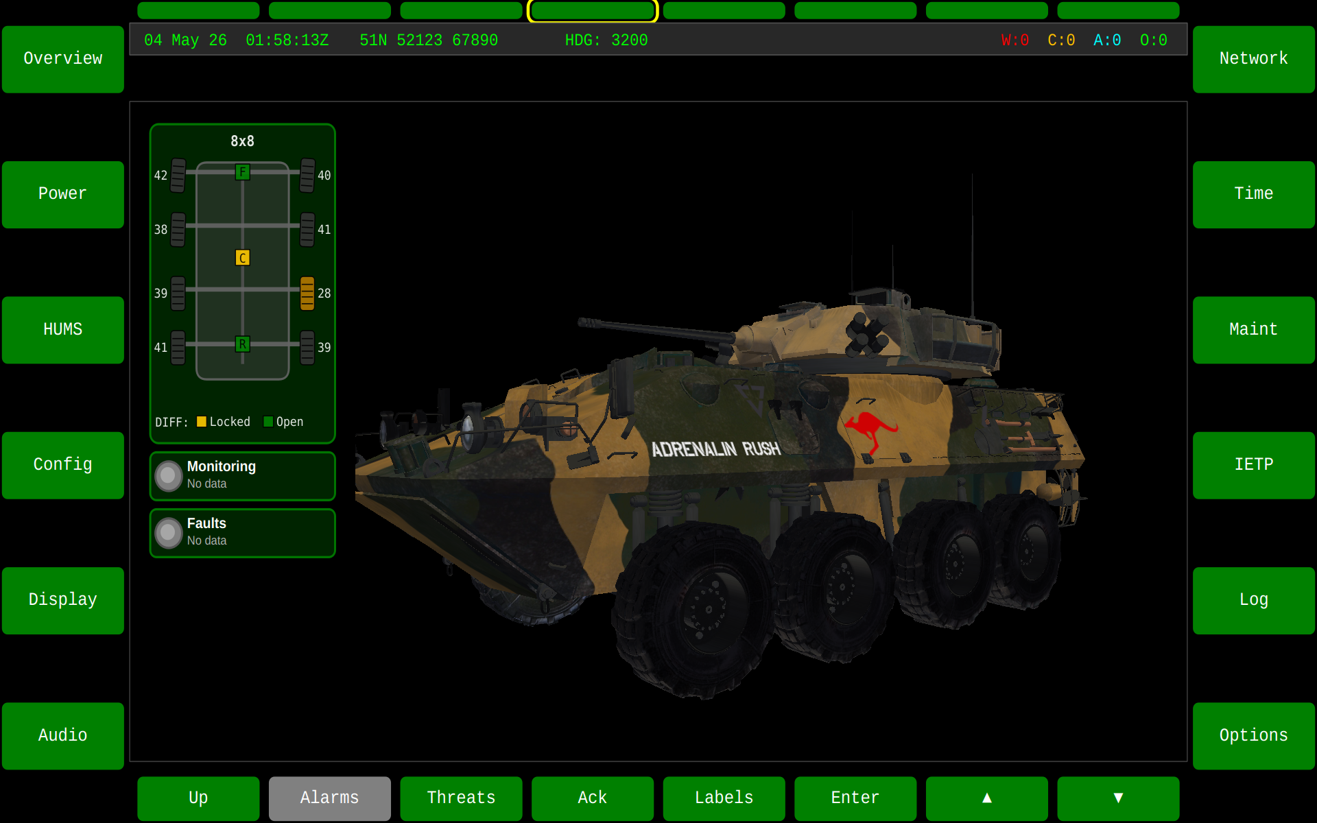
DEF STAN 23-009 (GVA Standard)
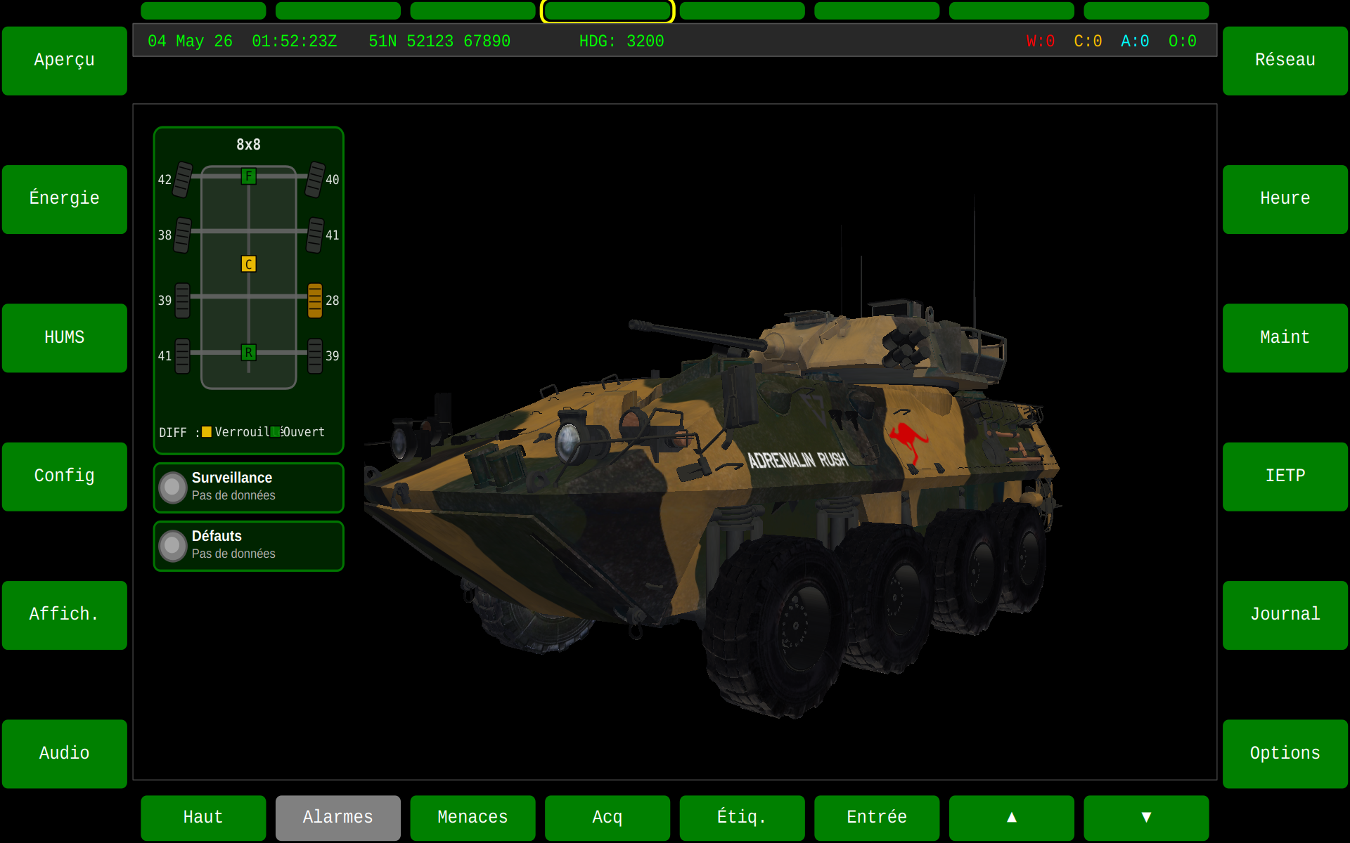
The default theme implements the exact colours specified in DEF STAN 23-009 Part 2 Issue 3 — flat green keys with white text, grey unavailable state, and yellow selection borders. This is the mandatory baseline for UK MoD GVA programmes.
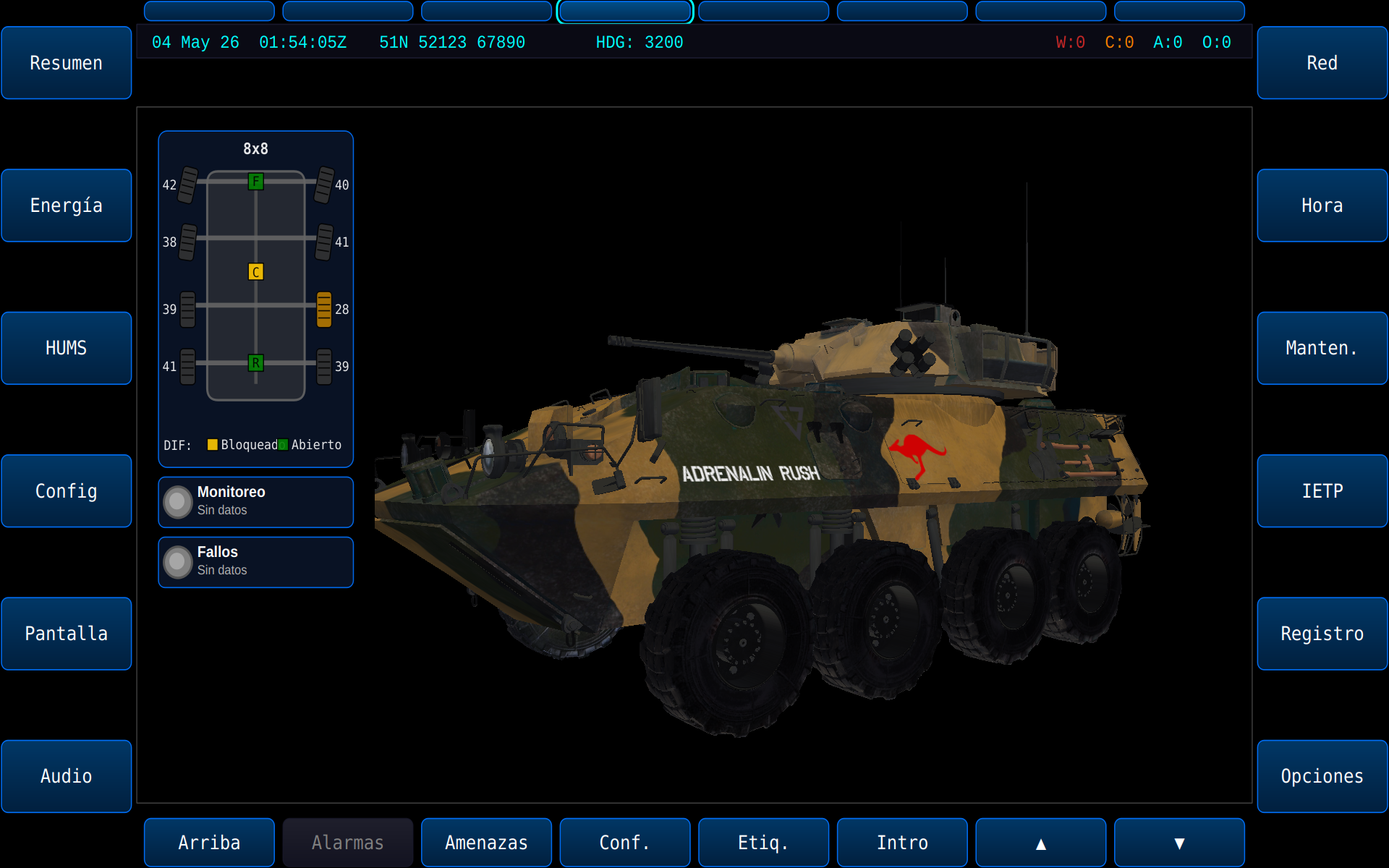
Astute Blue
A modern branded theme using the Astute Systems colour palette — navy backgrounds with cyan accents in vertical gradient fills. Suitable for demonstrations, trade shows, and commercial deployments.
Android (Material Dark)
A Material Design inspired dark theme with subtle rounded corners and muted colour palette suitable for extended use in low-light environments.
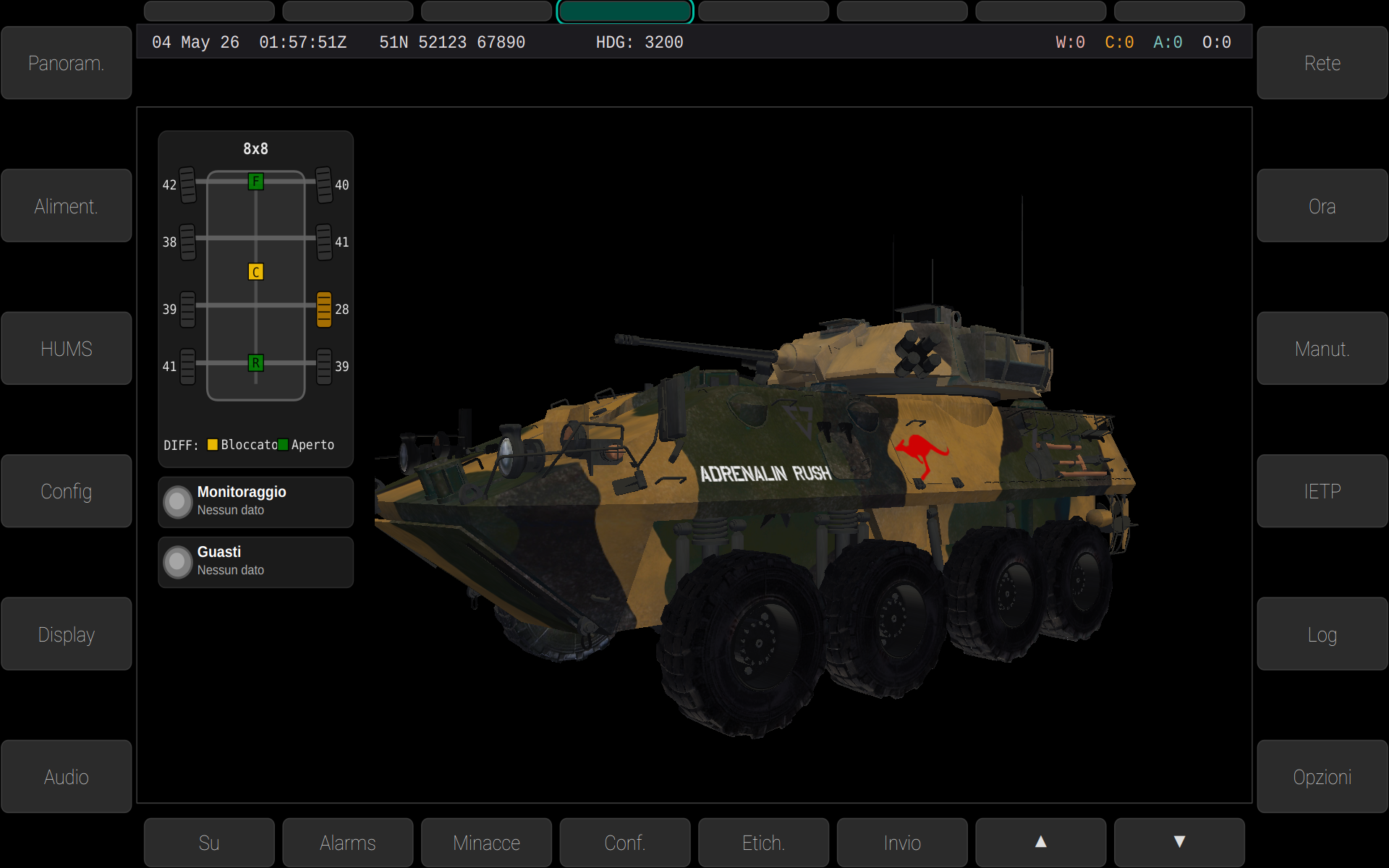
High Contrast
A WCAG AAA compliant high contrast theme designed for maximum readability and accessibility in all lighting conditions. Recommended for deployment in bright sunlight or for operators with visual impairments.
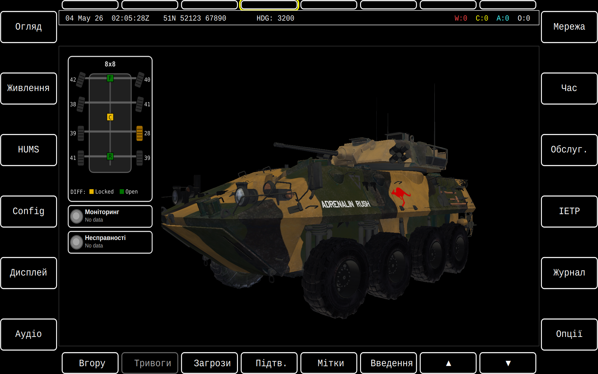
Selecting a Theme
Themes can be set via three methods (in priority order):
-
Command line (highest priority):
-
Configuration file (
gva-hmi.json): -
Default: DEF STAN 23-009 flat green theme
Creating Custom Themes
Custom themes are defined in JSON within the gva-hmi-config.json configuration file under the "themes" key. Each theme is a named object containing colour definitions, fill styles, typography, and widget styling. Themes are loaded at startup and registered in the runtime theme registry.
Theme JSON Structure
A complete custom theme definition:
{
    "themes": {
        "my-custom-theme": {
            "name": "My Custom Theme",
            "fillStyle": "linearGradientV",
            "cornerRadius": 8.0,
            "ppiStyle": "modernTankWithSight",
            "keys": {
                "available": {
                    "bgStart": "#1a3a5c",
                    "bgEnd": "#0d1f33",
                    "text": "#00FFFF",
                    "border": "#00FFFF",
                    "borderWidth": 1.5,
                    "opacity": 1.0
                },
                "selected": {
                    "bgStart": "#2a5a8c",
                    "bgEnd": "#1a3a5c",
                    "text": "#FFFFFF",
                    "border": "#FFD700",
                    "borderWidth": 3.0,
                    "opacity": 1.0
                },
                "unavailable": {
                    "bgStart": "#2c2c2c",
                    "bgEnd": "#1a1a1a",
                    "text": "#808080",
                    "border": "#404040",
                    "borderWidth": 1.0,
                    "opacity": 0.7
                }
            },
            "statusBar": {
                "available": "#1a3a5c",
                "selected": "#2a5a8c",
                "unavailable": "#555555"
            },
            "infoBar": {
                "background": "#0a1628",
                "border": "#1a3a5c",
                "textNormal": "#00FF00",
                "textWarning": "#FF0000",
                "textCaution": "#FFBF00",
                "textAdvisory": "#00FFFF"
            },
            "scene": {
                "background": "#0a0a14",
                "panelBackground": "#1c1c1e",
                "separator": "#2a2a3c",
                "selectionHighlight": "rgba(0,255,255,60)"
            },
            "toggle": {
                "trackOn": "#00FFFF",
                "trackOff": "#1a1a1a",
                "knob": "#FFFFFF",
                "textActive": "#000000",
                "textInactive": "#808080"
            },
            "fonts": {
                "keyFamily": "Roboto",
                "keySize": 12,
                "keyWeight": 75,
                "toggleFamily": "Roboto",
                "toggleSize": 9,
                "toggleWeight": 75,
                "dataFamily": "Courier New",
                "dataSize": 12,
                "dataWeight": 50
            },
            "widgets": {
                "background": "#141e1e",
                "border": "#1a3a5c",
                "borderWidth": 1.0,
                "header": "#1e2837",
                "text": "#dcdcdc",
                "grid": "#2a2a3c",
                "alternateRow": "#192626",
                "selection": "rgba(0,255,255,100)",
                "cornerRadius": 8.0,
                "fontFamily": "Courier New",
                "fontSize": 10,
                "fontWeight": 50
            }
        }
    }
}
Theme Properties Reference
Top-Level Properties
| Property | Type | Default | Description |
|---|---|---|---|
name |
string | (key name) | Human-readable display name |
fillStyle |
string | "flat" |
Fill rendering style for keys and buttons |
cornerRadius |
number | 6.0 |
Corner radius for rounded rectangles (px) |
ppiStyle |
string | "classicTankWithSight" |
PPI vehicle symbology style |
Fill Styles
| Value | Description |
|---|---|
flat |
Solid single colour fill |
linearGradientV |
Vertical linear gradient (top to bottom) |
linearGradientH |
Horizontal linear gradient (left to right) |
linearGradientD |
Diagonal linear gradient (top-left to bottom-right) |
radialGradient |
Radial gradient from centre outward |
glass |
Glass-effect with highlight and transparency |
PPI Styles
| Value | Description |
|---|---|
simple |
Minimal vehicle outline |
classicTankWithSight |
Classic tank silhouette with gun sight indicator |
classicTankWithoutSight |
Classic tank silhouette without sight |
classicArrowWithSight |
Arrow/chevron indicator with sight |
classicArrowWithoutSight |
Arrow/chevron indicator without sight |
modernTankWithSight |
Modern stylised tank with sight |
modernTankWithoutSight |
Modern stylised tank without sight |
Key State Colours (keys.available, keys.selected, keys.unavailable)
| Property | Type | Description |
|---|---|---|
bgStart |
colour | Fill gradient start (or solid colour if flat) |
bgEnd |
colour | Fill gradient end (ignored if flat) |
text |
colour | Text/label colour |
border |
colour | Border/outline colour |
borderWidth |
number | Border pen width in pixels |
opacity |
number | Overall opacity (0.0–1.0) |
Colour Formats
Colours can be specified in any of these formats:
"#RRGGBB"— standard hex (e.g."#00FFFF")"#AARRGGBB"— hex with alpha (e.g."#8000FFFF")"rgba(R,G,B,A)"— RGBA with alpha 0–255 (e.g."rgba(0,255,255,60)")- Named Qt colours (e.g.
"white","black","red")
Minimal Custom Theme
You only need to specify the properties you want to override — unspecified values use sensible defaults:
{
    "themes": {
        "desert-tan": {
            "name": "Desert Operations",
            "fillStyle": "flat",
            "keys": {
                "available": {
                    "bgStart": "#8B7355",
                    "text": "#FFFFFF",
                    "border": "#4A3C28"
                },
                "selected": {
                    "bgStart": "#A0854D",
                    "text": "#FFFFFF",
                    "border": "#FFD700",
                    "borderWidth": 3.0
                }
            }
        }
    }
}
Using a Custom Theme
Once defined in the config file, reference the custom theme by its key name:
Or set it in the configuration file:
Multiple Themes in One Config
You can define multiple custom themes alongside overrides of built-in themes:
{
    "themes": {
        "defstan": { ... },
        "blue": { ... },
        "customer-acme": {
            "name": "ACME Defence",
            "fillStyle": "linearGradientV",
            "keys": { ... }
        },
        "night-ops": {
            "name": "Night Operations",
            "fillStyle": "flat",
            "keys": { ... }
        }
    },
    "theme": "customer-acme"
}
Note
The runtime theme registry is populated from the "themes" JSON object at startup. If no themes are defined in the config, only the compiled-in DEF STAN 23-009 fallback is available.
See Also
- Language Support — multi-language UI translations
- GVA HMI Overview — full HMI documentation